Whatever your industry, creating product packaging that attracts customer attention isn’t easy. The 2025 marketplace is global, saturated and competitive. Fresh ideas are hard to come by. Every brand wants to make an impact, and many variables are at play—from logos, fonts and other visuals to colours, textures and materials.
In this blog, we’re going to focus on the colour psychology side of things. We’ll examine how the hues you choose for your self-adhesive labels and product packaging adjust your customers’ perceptions and shift your brand’s overall identity.
We may even inspire you to make a change to your current palette…
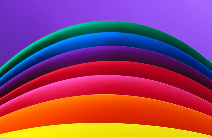
Labelling colour psychology: The basics
Scientists and sociologists agree that we subconsciously associate certain colours with certain emotions. These associations change with time, context and culture, but there are some broadly accepted concepts of colour personality that you can use to guide your choices:
- White: White is a conservative choice, a canvas, a signal of cleanliness or simplicity. It’s not necessarily very striking. In Eastern cultures, white can symbolise mourning and death.
- Black: Black is a powerful, luxurious colour. It evokes elegance and mystery. Like white, it can fail to draw attention if not paired with another colour.
- Grey: Grey is similar to white—calm, conservative and neutral. And, like both black and white, it’s often best used as the background to a bolder hue.
- Gold/silver: With the correct metallic finish, gold or silver shades and accents convey luxury and quality. They look expensive. Silver is a slightly subtler, less ‘opulent’ choice than gold.
- Brown: Brown is a stable, comfortable colour. It’s often associated with the earth and nature. But it doesn’t always shine on the shelf.
- Red: Red packaging conveys excitement, passion and courage. In some cases, love. In other cases, danger. In Eastern cultures, red can symbolise celebration and good luck.
- Orange: Orange is an adventurous, enthusiastic hue that often connotates fun in packaging. It’s also often used for ‘value’ and affordable products, creating that secondary association.
- Yellow: Yellow is joy and optimism. It’s sunny and youthful. Like orange, most customers see yellow as ‘cheap’ or ‘fun’. In Eastern cultures, yellow can symbolise danger or envy.
- Green: Green is a well-balanced colour representing safety, wealth and growth. It conveys both wealth and success AND nature and health. Many eco-friendly products are green.
- Blue: Blue represents calm and honesty. It’s a ‘safe’ choice because it’s the most common favourite colour (for both men and women). That said, it can also be seen as a ‘sad’ colour.
- Purple: Purple shades are lively and exciting. They reflect spirituality and luxury. Purple is both a regal and a mystical colour, more popular with women and younger people.
- Pink: Pink is a loving, feminine hue. It’s still generally used to target women in 2025, with brighter pinks targeting a younger audience and muted, ‘dusky’ pinks targeting older women.

Choosing the right colour palette
Every colour has its pros and cons. When choosing shades and shade combinations for your packaging, consider what your brand is trying to achieve and who you’re trying to appeal to.
While red might evoke passion and excitement for some potential customers, it’s also a more ‘angry’ and ‘direct’ colour to others. On the other end of the spectrum, blue could evoke feelings of calm and serenity in your customers—but might also represent sadness or seem ‘boring’, depending on the audience and industry.
Ask, when you’re considering an option, is this colour/colour palette:
- Aligned with the specifics of your industry? – In terms of research into customer behaviour, there’s a reason some industries favour specific colours. (Lots of food products are green, lots of value products are orange, and lots of social media platforms are blue.) Do your research on the no-go colours and consider the extra variables of your particular niche.
- Going to have shelf appeal alongside competitor products? – This is connected to the previous question. Once you know what’s happening in your industry—the established ‘rules’, if you will—you can subvert these more intelligently to create a standout final product that gets your target customer’s attention but doesn’t completely throw them off.
- Aligned with your target audience? – To give an extreme example—if you’re hoping to target primarily men aged 40-50 but all your products are bright pink, the chances are you won’t perform that well compared to your competitors. Your target audience should live at the heart of every branding decision you make, including the colour of your labels.
- Appropriate for everywhere you’ll be selling? – As mentioned a few times in the colour breakdowns, some cultures have different perceptions of the same colour. While Western cultures tend to see white as pure, clean and neutral, many Eastern cultures use white as their mourning colour. Consider your entire market if you’re selling products internationally.
- Brand-cohesive, aligned with established voice/personality? – Doing a colour 180 might be appealing, but it’s not something to rush into. Any colour you choose should be consistent and aligned with existing branding (unless you’re doing a total rebrand). A new product with packaging that doesn’t align with your existing brand voice will harm visibility and reputation.
Interested in working with us to update or create a label design, incorporating new hues and making use of colour psychology principles?
Get in touch anytime to start a conversation. Our label printing technology is state-of-the-art, and our services are tailored and flexible.